Maggie Holter
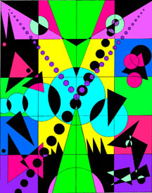
Toxic Breeze: I choose colors that were really bright and funky. Neon’s and just randomly placed them in my grid. I thought a breeze isn’t organized, so why should this be organized.
Frankly Basic: I chose two colors that are perfectly organized into some boring columns and THAT’S IT! Frankly it’s quite a basic arrangement.
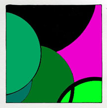
Economic Instability: When I saw this saw all these different color greens thrown off by a bright color that looks completely out of place. To emphasize that everything can look like it fits and it works when it is really completely unstable.
Decayed Bananas: I have a tendency to leave bananas out, so I personally thought this would be a fun color to do. It is all kinds of yellows and browns and some orange, like the bananas on my kitchen counter.
A State of Melancholy: I choose several different shades of purple, because since I was little purple was always a very sad color. Then I warped it a little because when you are really in a “state of melancholy” nothing seems stable and nothing makes sense.