Lauren deVane
CHAOTIC CONDIMENTS-
I chose red and yellow for my colors an then blended them in order to give the look of them mixing together. The red is supposed to signify ketchup and the yellow, mustard. I think that these colors are the two colors that people immediately think of when they hear the word “condiments”. And since the describing word is chaotic, I thought that if they were all blended together it would fit the word well.
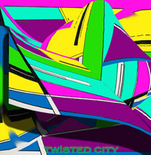
TWISTED CITY-
The colors I chose for this one were very bright green, aqua, a bright yellow, a purple and a blue. I just thought about at night in some cities like Vegas, its all neon light signs everywhere. It reminds me of a city scene that is in the movie Artificial Intelligence, that’s pretty much where I got my inspiration for this one. And I thought that warping it a couple times in different directions would give it the “twisted” feel.
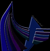
BLACKBERRY TRAIL-
The colors I chose for this were black, dark blues and dark purples. The reason for this is pretty much self explanatory, blackberries, are dark blue. And I just thought that using colors close to it would make it look better than just one color, which is why I chose purple. I think that it really looks like a trail, so it really takes on the whole name.
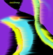
TOXIC BREEZE-
For this one, I also used really bright colors, but I can’t figure out why. When I hear the word toxic, usually I would think like pollution and brown smoggy colors. But for some reason, I was thinking of toxic as, intoxicating. I think that these colors could be considered “neon” colors, and for some reason I was associating that with being toxic, maybe because chemicals are toxic and they’re full of radiation which again for some reason I connect with being neon.