ryan paule .2D design > interpreting color
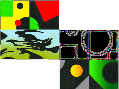
The color scheme for this box is called chaotic condiments. I chose a bold yellow, green, and red to describe the color of mustard, relish , and ketchup. I also added a texture to the green to make it appear more like relish. These colors show what chaotic condiments are.
In this box I chose a light blue flowing into a dull green to describe toxic breeze. The dull green is my idea of what toxic would look like and the light blue reminds me of a breeze. I added the liquefy effect in to give it a sense of a hazardous looking breeze.
The name of this color scheme is blacklight bingo so I figured it would mainly be black but with bright highlights of many colors including red and blue, which are what colors come to my mind for bingo. I used the glowing edges filter to make this design.
The colors I chose for this box are two shades of green, yellow, orange , and gray. The name of the color scheme is Guarded Entrance and when I heard this, the scene of a castle guarded by a fire-breathing dragon came to my mind.